
Wednesday, March 16, 2011
MCO Update March 16, 2011
The 9.0 earthquake in Japan has caused the Japanese markets to crash. What we are seeing now is the spillover into the US and world markets as investors become highly risk adverse. Also elevating investor anxiety is the uncertainty over the reactor failures in Japan. The situation is very fluid and not good, so even though the fundamentals of the US markets haven't changed that much, just the fear is enough to prolong the bottoming process.

Click to enlarge

Monday, August 2, 2010
Trending higher
As expected we had a pause before resuming the trend higher. The McClellan Oscillator is constructed the same way as a MACD - it is the difference between two moving averages (of the advance-declines). When it becomes "overbought" like it is now, this is not necessarily a sell signal. It is an indication that the shorter timespan average is still increasing faster than the longer timespan average and is pulling it higher. Again the shorter term component, the 10% Index has gone above +500 which indicates the trend remains strongly higher -- even though we could have a short term correction at any time. As the rally matures, the upward trends of the two MCO components tend to merge (the MCO declines) but as long as the 5% and 10% Index values stay positive the rally will continue to coast higher. The previous chart markups are still relevant.

The McClellan Oscillator
Click to enlarge

Click to enlarge
Monday, July 26, 2010
MCO Update
The reversal pattern continues to develop. The McClellan Oscillator finished the day with a +300 reading. This is in the overbought zone and offers the potential for a corrective move. The question at hand is how deep the correction might be. One factor to be considered is that the last overbought peak was in the +250 area and led to a fairly deep correction. Scanning across the chart to the left one might be inclined to think this would be the case again.
Two factors seem different to me this time. First, the MCO made higher highs this time (while the index didn't) which I interpret as a sign of increasing momentum on the upside. Second, the 10% Index finished at +668 which means that market breadth is very strong to the upside and that after any interim correction prices will move higher. At the previous MCO peak at +250 the 10% Index failed to get above +500 -- indicating that fewer issues were participating and that sentiment towards stocks still remained weak with sellers rushing in to unwind long positions. The initial MCO spike to +250 was probably short covering.
I would also note that sentiment measurements (AAII, II etc) are still bearish indicating that this rally has a ways to go on the upside.
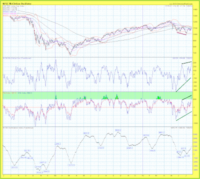
The McClellan Oscillator
Click to enlarge
Two factors seem different to me this time. First, the MCO made higher highs this time (while the index didn't) which I interpret as a sign of increasing momentum on the upside. Second, the 10% Index finished at +668 which means that market breadth is very strong to the upside and that after any interim correction prices will move higher. At the previous MCO peak at +250 the 10% Index failed to get above +500 -- indicating that fewer issues were participating and that sentiment towards stocks still remained weak with sellers rushing in to unwind long positions. The initial MCO spike to +250 was probably short covering.
I would also note that sentiment measurements (AAII, II etc) are still bearish indicating that this rally has a ways to go on the upside.

Click to enlarge
Tuesday, July 13, 2010
SPX cycle chart

drawn in as vertical bars. Click to enlarge
The data set goes back to 2007 and the cycle periods are visually fitted to the data with an emphasis on the most recent price activity.
Of note is the 55.5 TD cycle (333 - 65 min bars) which had been reliable in the past but became less so after the crash in 2008.
Wednesday, July 7, 2010
A reversal is in the making.
For the first time in a couple of months we are starting to see bullish developments in the market indicators. The McClellan Oscillator and its components have finally made a rising lows pattern and are diverging bullishly from the SPX price which made lower lows. In addition, on the recent low, the 10% indicator held above the -500 threshold which is a necessary condition to establish a bottoming pattern. What I would like to see next would be a rise above +500 for the 10% Index as a confirmation that the market has enough power to establish a new leg up.

The McClellan Oscillator with a bullish divergence from price.
Click to enlarge.

The percentage of stocks above their moving average.
Click to enlarge.

Click to enlarge.

Click to enlarge.

Click to enlarge.

Subscribe to:
Posts (Atom)